The fusionSpan Blog

Creating Marketing Dashboard in Tableau

Author Image
By Maksim Kazartsev |September 5, 2024
Salesforce

In today’s competitive landscape, non-profit organizations need to harness the power of data to effectively market their missions and engage their audiences. A well-designed marketing dashboard can provide invaluable insights, enabling organizations to track campaign performance, understand donor behavior, and make data-driven decisions.

This article will guide you through the process of creating a comprehensive marketing dashboard in Tableau, focusing specifically on analyzing the performance of digital marketing campaigns. Offering practical steps and tips, this guide will help you visualize your marketing data and optimize your strategies for maximum impact.

Before you begin, you can view a completed version of the marketing dashboard here. This example will give you an idea of what you will be building throughout this guide.

Data Overview

For this guide, we will use a dataset containing fake digital marketing campaign data. This dataset includes various metrics such as impressions, clicks, conversions, and costs across multiple campaigns.

dashboard_source_file.xls

Learning Resources

To help you get started with creating dashboards in Tableau, you can use the following link to the official Tableau how-to videos. These resources are optional but highly recommended for those who want additional guidance.

  • Tableau How-To Videos: This series of short, 2-3 minute videos offers a quick and easy way to learn the basics of Tableau, from connecting to data sources to building interactive dashboards.

Practical Steps for Dashboard Creation

This chapter is divided into three main sections:

  1. Connecting to Data Source
  2. Designing Worksheets
  3. Assembling Dashboard

These sections will guide you through the entire process, from connecting to your data source to building and finalizing your marketing dashboard.

Connecting to Data Source

Establishing a connection to the data source is the first step in building your marketing dashboard, ensuring that your data is ready for analysis and visualization.

Follow these instructions to open the provided sample source file in Tableau and start using it:

  1. Launch Tableau.
  2. In the Data Source tab, click Add and select Microsoft Excel. A list of available sheets for the file will appear below.
  3. Drag the data sheet to the blank area to the right. The data fields information and data preview will be shown.

Add a connection

Designing Worksheets

In this section, we’ll focus on creating worksheets in Tableau. Worksheets are the building blocks of your dashboard, where you design and configure individual charts, graphs, and visualizations. By carefully crafting each worksheet, you can ensure that your final dashboard will provide clear, actionable insights.

Creating calculated fields

Calculated fields in Tableau allow you to create new data from existing data in your dataset. This is particularly useful for deriving metrics that are not directly available in the source data.

Follow these instructions:

  1. Switch to the Sheet 1 tab which was created for you by default.
  2. In the Tables pane to the left, right-click on empty space and select Create Calculated Field.
      1. Give it a name calc_CTR
      2. In the formula text area, enter the following expression and click Ok

        SUM([Clicks]) / SUM([Impressions])

  3. In the Tables pane to the left, right-click on empty space and select Create Calculated Field.

    1. Give it a name Num_of_records. We will need this field to know the number of records per channel.

    2. In the formula text area, enter the following expression, type in “1” (without quotes) and click Ok

Creating Summary Statistics sheet

In this worksheet, the main KPIs will be displayed.

  1. Right-click the Sheet 1 tab title, select Rename, and give it a new title Summary Statistics

  2. Drag and drop the Measure Values item from the left pane to the Text icon in the Marks block.

  3. Drag and drop the Measure Names item from the left pane to the Columns shelf at the top of the screen.

  4. Update metrics formatting to set the appropriate font, font size, font color, and other settings.

  5. Ensure the right aggregation is applied to the measures.

Summary Statistics sheet

Creating Campaign Performance sheet

In this worksheet, we will add a scatter plot to show the relationship between the Leads and Total Spendings.

  1. Click the New Worksheet and name it Campaign Performance.

  2. Drag and drop the Cost measure from the left pane to the Columns shelf at the top of the screen.

  3. Drag and drop the Leads measure from the left pane to the Rows shelf at the top of the screen.

  4. Drag and drop the Campaign Name dimension from the left pane to the Detail icon in the Marks block.

  5. Drag and drop the Cost measure from the left pane to the Color icon in the Marks block.

  6. Click the Analytics tab in the upper-left corner, select Trend Line and drag and drop it to the scatter plot area.

  7. Adjust formatting so that the sheet looks as in the screenshot below

Campaign Performance sheet

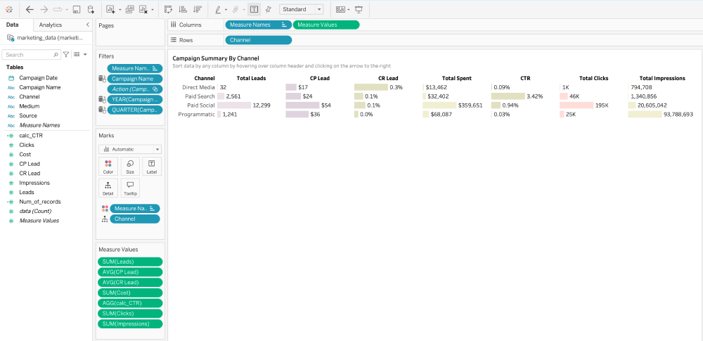
Creating Campaign Summary By Channel sheet

In this worksheet, we will be displaying KPIs grouped by the channel name.

  1. Click the New Worksheet and name it Campaign Summary By Channel.

  2. Drag and drop the Measure Name item from the left pane to the Columns shelf at the top of the screen.

  3. Drag and drop the Measure Values item from the left pane to the Columns shelf at the top of the screen.

  4. Drag and drop the Channel dimension from the left pane to the Rows shelf at the top of the screen.

  5. Drag and drop the Channel dimension from the left pane to the Detail icon in the Marks block.

  6. Click the Label icon in the Marks block and select Show mark labels.

  7. Click the Color icon in the Marks block and set Opacity to be 30%.

  8. Adjust formatting so that the sheet looks as in the screenshot below.

Campaign Summary By Channel sheet

Creating Campaign Summary By Source Sheet

In this worksheet, we will be displaying KPIs grouped by the source name.

  1. Click the New Worksheet and name it Campaign Summary By Source.

  2. Drag and drop the Measure Name item from the left pane to the Columns shelf at the top of the screen.

  3. Drag and drop the Measure Values item from the left pane to the Columns shelf at the top of the screen.

  4. Drag and drop the Source dimension from the left pane to the Rows shelf at the top of the screen.

  5. Drag and drop the Source dimension from the left pane to the Detail icon in the Marks block.

  6. Click the Label icon in the Marks block and select Show mark labels.

  7. Click the Color icon in the Marks block and set Opacity to be 30%.

  8. Adjust formatting so that the sheet looks as in the screenshot below.

Campaign Summary By Source Sheet

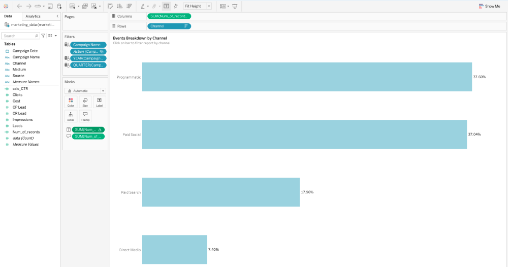
Creating Channel Usage sheet

In this worksheet, we will add a bar graph displaying the number of marketing events per channel.

      1. Click the New Worksheet and name it Channel Usage.

      2. Drag and drop the Num_of_records item from the left pane to the Columns shelf at the top of the screen.

      3. Drag and drop the Channel dimension from the left pane to the Rows shelf at the top of the screen.

      4. Click the Label icon in the Marks block and select Show mark labels.

      5. Drag and drop the Num_of_records item from the left pane to the Label icon in the Marks block, then right-click it and select Quick Table CalculationPercent of total

      6. Click the Tooltip icon in the Marks block and in the text area enter the following:
        <SUM(Num_of_records)> events (<% of Total SUM(Num_of_records)>)
      7. Adjust formatting so that the sheet looks as in the screenshot below.
Channel Usage Sheet

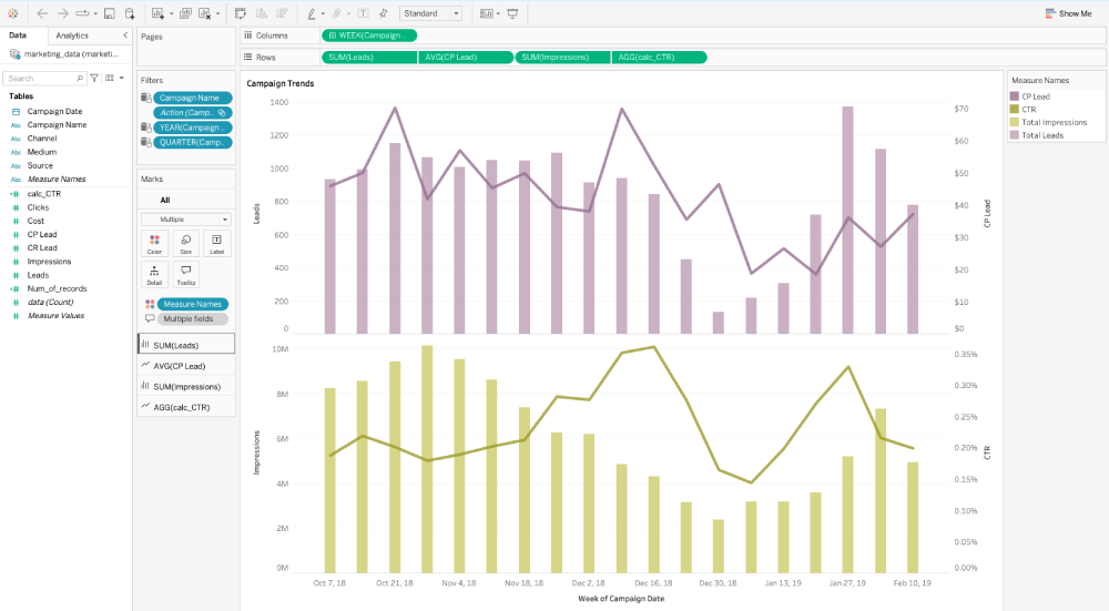
Creating Campaign Trends sheet

In this worksheet, we will add graphs to display trends for the essential marketing KPIs.

  1. Click the New Worksheet and name it Campaign Trends.
  2. Drag and drop the Campaign Date dimension from the left pane to the Columns shelf at the top of the screen. Then, right-click it and select Week Number.
  3. Drag and drop the Leads measure from the left pane to the Rows shelf at the top of the screen.
  4. In the Marks block, select SUM(Leads) and then Bar in the drop-down menu.
  5. Drag and drop the CP Lead measure from the left pane to the Rows shelf at the top of the screen.
  6. In the Marks block, select AVG(CP Lead) and then Line in the drop-down menu.
  7. In the Rows shelf, right-click AVG(CP Lead) and then select Dual Axis.
  8. Drag and drop the Impressions measure from the left pane to the Rows shelf at the top of the screen.
  9. In the Marks block, select SUM(Impressions) and then Bar in the drop-down menu.
  10. Drag and drop the calc_CTR measure from the left pane to the Rows shelf at the top of the screen.
  11. In the Marks block, select AVG(CPcalc_CTRLead) and then Line in the drop-down menu.
  12. In the Rows shelf, right-click AVG(calc_CTR) and then select Dual Axis.
  13. In the Marks block, click the Color icon, then Edit colors and select the appropriate colors for all the added measures.
  14. Adjust formatting so that the sheet looks as in the screenshot below.
Campaign Trends sheet

Assembling Dashboard

In this section, we’ll combine the created worksheets, arrange them on a single dashboard, and add interactive filters. This final step will ensure that your dashboard provides a comprehensive view of your digital marketing campaign performance, enabling you to make data-driven decisions with ease.

Follow the instructions:

  1. Click New Dashboard and name it DM Dashboard.

  2. In the Dashboard menu to the left, set the custom size to be of 1100px width and 1200px height.

  3. In the Objects menu to the left, select the Show dashboard title checkbox and ensure the Tiled option is selected.

  4. From the Objects menu to the left, drag and drop the Vertical Container element to the dashboard area. It will be used as a main container having all the dashboard elements inside.

  5. Switch to the Layout tab in the upper-left corner, and in the Item hierarchy block below, select the newly added Vertical Container.

  6. For the Vertical Container:

    1. select Floating checkbox

    2. set Positing to be x=0, y=0,

    3. set Size to be w=1100 and h=1200

    4. set Background to use 90% opacity and light gray color

  7. Inside the Vertical Container:

    1. Place the dashboard title element

    2. Add Blank element

    3. Add a Horizontal Container with the Summary Statistics sheet inside of it

    4. Add a Horizontal Container with the Campaign Performance and Channel Usage sheets inside of it

    5. Add a Vertical Container with the Campaign Trends and Campaign Summary By Channel sheets inside of it

    6. Add a Vertical Container with the Campaign Summary By Source sheet inside of it.

  8. For each container in the dashboard, set the appropriate inner and outer paddings so that the elements in the dashboard do not stick to each other and have some free space around them.

  9. Add three filters to the dashboard: Campaign, Year and Quarter. To ensure that the filters apply to all relevant worksheets on the dashboard, click the drop-down arrow on each filter card and select Apply to Worksheets and Only Relevant Values options.

  10. Save changes and publish the dashboard.

Once you have completed all the steps, you can compare your results with a completed version of the marketing dashboard by viewing it here

Dashboard final view

Support from fusionSpan

fusionSpan is a trusted support partner for Tableau, offering specialized assistance to clients considering starting to use Tableau as well as those already using it. They provide a range of services, including implementation, customization, and ongoing support to ensure organizations can fully utilize Tableau’s capabilities. By partnering with fusionSpan, non-profit organizations can access expert guidance and support tailored to their specific needs, helping them maximize the impact of their data analysis efforts. Whether you need help with setting up your first dashboard, or optimizing your existing Tableau environment, fusionSpan is there to provide the expertise and resources you need to succeed.

Conclusion

Tableau is a powerful tool that can transform how non-profit organizations analyze and visualize their data. This guide provided a practical approach to creating a marketing dashboard, enabling effective tracking and optimization of digital marketing campaigns.

With the right staff, training, and support from partners like fusionSpan, non-profits can fully leverage Tableau’s capabilities, unlocking valuable insights for better decision-making and greater impact. Enhancing data-driven approaches through Tableau helps non-profits achieve their missions more effectively.

Maksim Kazartsev
Creating Marketing Dashboard in Tableau

Maksim Kazartsev is a Senior Data Analyst at fusionSpan, where he works on data migration projects, ensuring seamless transitions for clients from their legacy AMS to Salesforce by leveraging expertise in SQL, Python, and ETL processes. He has been in IT since 2006. With over 7 years in data analysis and business intelligence, Maksim has a proven track record in driving data-driven decisions and enhancing data quality. Previously, he excelled as a Senior Data Analyst at Rock Your Data and HeadHunter, contributing to customer retention, business intelligence, and sales strategy optimization through advanced data analysis and BI dashboard development. Maksim is a certified Agile professional and a passionate advocate for data integrity and actionable insights.

More posts