 Every association leader has lived this story: the board asks a simple question.
“How many members are likely to renew this year?”
And three departments give three different answers. Marketing has one number based on email engagement. Membership has another prediction from the AMS. Finance counters with revenue trends that don’t match either version.
The meeting stalls. Confidence dips. Trust in the data, decisions, and leadership quietly erodes.
Why Trust Begins with Data
For associations, your reputation – and the trust it raises – is your biggest competitive advantage and the currency that powers everything from membership growth to advocacy board efficiency.
Incomplete, inaccurate, or misinterpreted data is one of the fastest ways to damage this asset.
A duplicative process here, a broken integration there. These add up to create an organizational foundation that is not grounded in reality.
When executives, managers, board members – heck, even your assistants and interns – can’t rely on a single version of the truth, every decision is undermined by a shadow of doubt. Conversations are cyclical, progress is slow, and disillusionment takes root.
This environment kills innovation and growth.
The antidote is a data environment designed for consistency and transparency where leadership and staff alike know where data comes from, trust its accuracy, and have the tools to put it to use in creating better member value over time.
 The Cost of Standing Still
So you don’t trust your data.
And because of that, you don’t use it to make decisions. Or maybe you do, but it’s a “finger-crossing”, “throwing-spaghetti-at-a-wall” moment every time.
Go ahead and take a moment to imagine saying that out loud to your team, your boss, (gulp) a member… Scary, right?
It just might trigger the same emotions as showing up to a final exam completely unprepared – a little bit of shame, embarrassment, dread? Because the truth is, in this day and age? This type of data governance (or lack thereof) is irresponsible.
The risks of accepting unsound, outdated, or siloed data practices are far greater than just the occasional inefficiency.
At the business level, weak data practices erode confidence and stall growth, making it difficult to champion new initiatives and facilitate innovation.
Operational risks emerge when staff waste hours reconciling spreadsheets. Teams reinvent reports in isolation, duplicating effort and introducing errors along the way.
Strategic risks can be the most damaging of all when weak data foundations stall innovation and put your reputation at risk.
Associations that delay modernizing their data foundations pay the price in lost time, lost credibility, and lost growth potential.
Rethinking Data as an Experience Engine
Traditionally, data has been something to collect, clean, and report on – a byproduct of operations. But the real power of data lies in how it shapes your future. When your data is clean, complete, and connected, it becomes a driver of member experience and organizational strategy.
We need to make the jump from reactive to proactive. Instead of reacting to what’s already happened – missed renewals, underperforming campaigns, dropping attendance – connected data lets you see AND CHANGE what’s coming next.
Associations that embrace this mindset see data not as a back-office infrastructure but as a front-line driver of relevance, retention, and growth. And when they build the culture and discipline to treat data this way, they move from managing records and tracking activity to designing relationships and driving sustainable, reliable growth.
 Where Should Your Association’s Data Live?
Not every association needs a sprawling data ecosystem with multiple environments. But your data does need a home, and there are a few options and combinations to choose from.
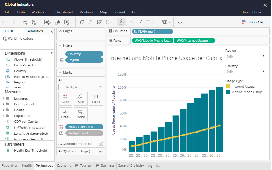
The Data Warehouse is a single source of truth. It’s structured, secure, and built for accurate reporting and analysis. Your warehouse stores curated data from systems like your CRM, LMS, and finance platform, and provides leadership with reliable data for insight generation. For most associations, this is all you need.
The Data Lake stores raw data like web clicks and survey responses. It’s flexible and inexpensive, but requires substantial governance to avoid becoming a “data swamp.” Lakes should be used in combination with a warehouse and are useful for larger organizations with heavy data volume.
The Lakehouse combines the functionality of both, offering the governance and structure of a warehouse with the flexibility of a lake. Lakehouses take the place of both warehouse and lake, and are appropriate for very large associations or those with advanced analytics needs.
It’s important to understand what each option does, so you can choose the right level of sophistication for your size, goals, and – crucially – your data culture. We’ll dig into that a bit more in part two of this blog. For most associations, though, simplicity wins. A well-designed warehouse can handle most reporting, analytics, and AI needs, especially when paired with disciplined governance and clear system ownership.
Why is it Important to Establish Data Ownership?
Technology alone does not prevent risk. Governance will. And an essential part of your governance framework is the clear definition of Authority and Storage.
Each data element needs both an authority and a storage home.
- Authority refers to the system of record, where the truth is created and maintained. For example, the CRM or AMS for memberships, the ERP for finance, or the LMD for certifications.
- Storage refers to the warehouse, lake, or lakehouse where data is curated, integrated, and analyzed. Storage never replaces authority.
Let’s take members as an example. The authoritative system for member information is the CRM. That’s where data like join date, renewal status, and demographic details are created and governed. For this example, we’ll assume that this is a large association with both a warehouse and a lake. Information from the authoritative system is stored in multiple places depending on each property’s characteristics. The warehouse holds the golden profile and deduped keys. The lake holds raw extracts like clickstream data or event logs.
This definition of authority and storage gives everyone clarity. The CRM remains the single source of truth for member data, while the warehouse and lake provide trusted, governed environments for analysis and innovation without ever rewriting the original record.
Where Should Reporting and Analytics Live?
 One of the most common missteps in data management is scattering reports across too many platforms. When each team has its own version of the truth, alignment becomes near impossible.
Here’s the golden rule:
- Operational reporting stays in the system of authority. Membership teams should check monthly renewals in your CRM, not in Snowflake.
- Strategic reporting should come from the data warehouse, where curated KPIs and compliance-ready metrics live. Your Director of Membership should look at Snowflake for year-over-year membership trends.
- Exploratory analytics and AI live in the lake or lakehouse, depending on your ecosystem. That’s where we experiment and predict without contaminating official numbers or disrupting established processes.
This separation ensures that everyone gets what they need: staff can act on operational data, leadership can trust strategic insights, and innovation can continue without creating confusion.
The Benefits of a Connected Data System.
A connected data system does more than improve reporting. It strengthens confidence, accelerates collaboration, and fuels innovation. When everyone is working from the same truth, your organization can make faster, clearer, and more member-focused decisions.
That’s the foundation for trust and the first step toward growth.
In Part 2, we’ll move from concept to execution. We’ll look at how to design your data architecture, choose the right platform, and build an environment that supports analytics, governance, and AI readiness without overcomplicating your operations