As a web design company, one of the first things we’ve had to tackle is the website navigation (also called the site information architecture or Sitemap). The site navigation often drives the entire website project and its content, so it is important to determine the site navigation early.
Most clients have a site that has become bloated as more and more content has been added to the site, and the site navigation is a 3-dimensional puzzle. Associations typically seek direction on what should go on the navigation menu of their new site. Everyone wants their content front and center, but also seek something manageable and clean.
While there is no one size fits all, here are some general principles on how to come up with a navigation menu for a website.
- Three-click Rule: This has been an unofficial design principle for a website navigation and it basically says that no information should be more than three clicks away. An end-user who has never been to your site should on average be able to find what they are looking for in three clicks or less. This rule has never been proven scientifically, but can serve as a good design ideal to aim for. The experts at User Interface Engineering (UIE) conducted a study on e-commerce sites and found that the more pages a user visited, the less they purchased from the site.
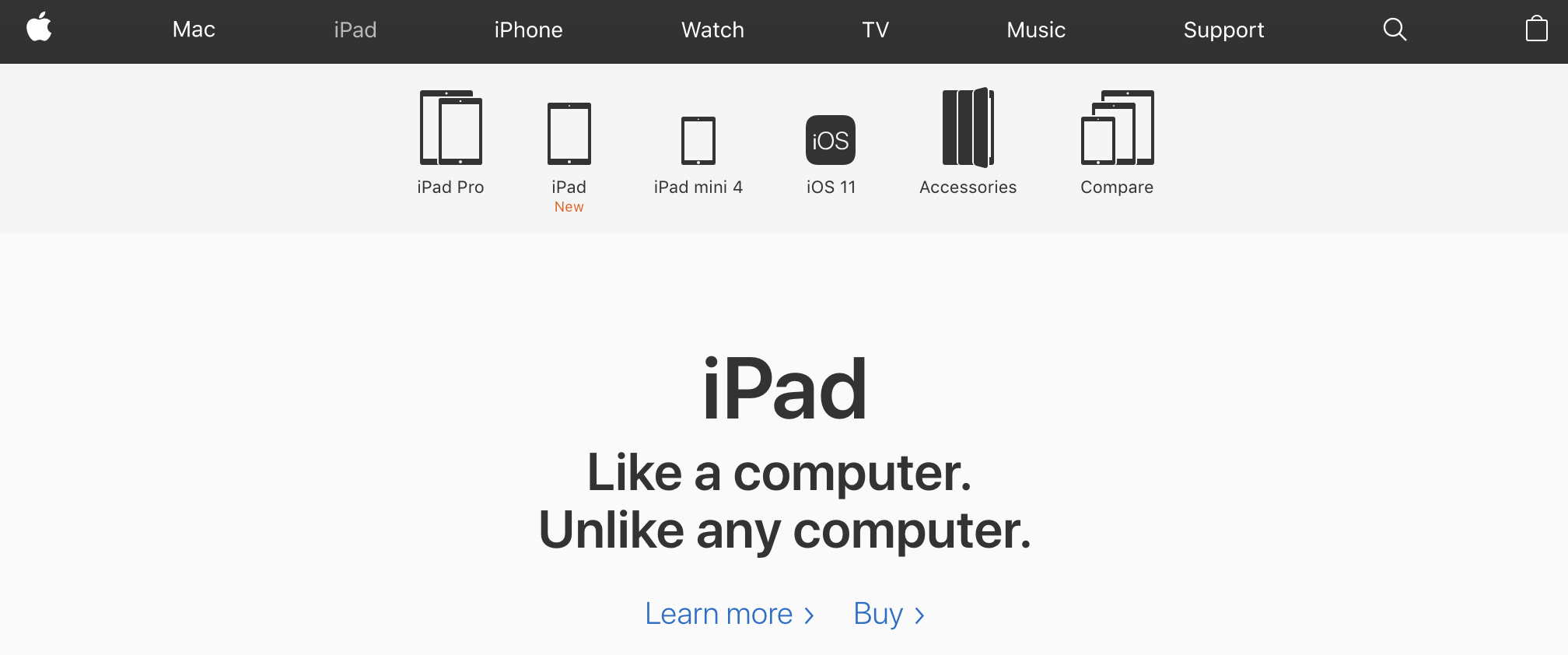
- KISS Principle: KISS or Keep it simple, sometimes is a well-established design principle that states that most simple systems work better than more complicated ones. Most people will agree that a website that has a simple menu with a limited number of choices is easier for users to navigate. Look at Apple for example – the largest company on the planet has a site with seven menu items in the main menu, but then each section has a second level menu that helps you find what you are looking for very quickly